HTML and CSS can be both used to display align and float images on your website. In this article, we’ll show you how to use HTML to align images to text (or other page elements) and how to use CSS to float images, wrapping text around it as you’d see in a newspaper or magazine.
Before we dive into the code, let’s look at the difference between aligned and floated images.
- Aligned images: using image align, you can choose a left, center, or right placement. The text doesn’t flow around the image but will be placed before or after it (as a block), depending on the chosen alignment.
- Floated images: when an image is floated, the text flows around the image. You can easily define additional CSS rules to ensure sufficient whitespace around the image. Float rules are also commonly used to arrange images in horizontal rows, as you find with image galleries and thumbnail selectors.
We’ll first go through the steps for aligning images with HTML, then show you how to float images with CSS.
HTML image alignment
Follow the steps below to image align to the left, the center, or the right of your webpage.
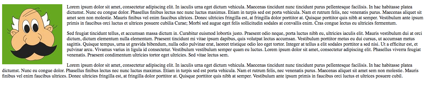
Left align
Use the following HTML code to align an image to the left:
<div><img src="myimage.jpg" width="100" alt="My Image" /></div>
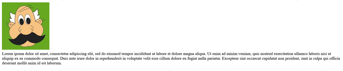
As you can see, the image is left-aligned, with the text displayed on the right.
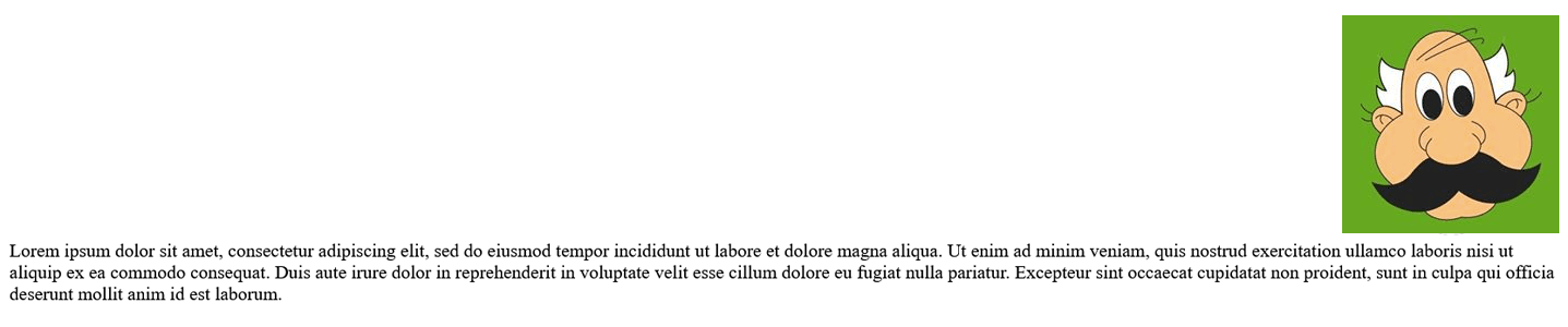
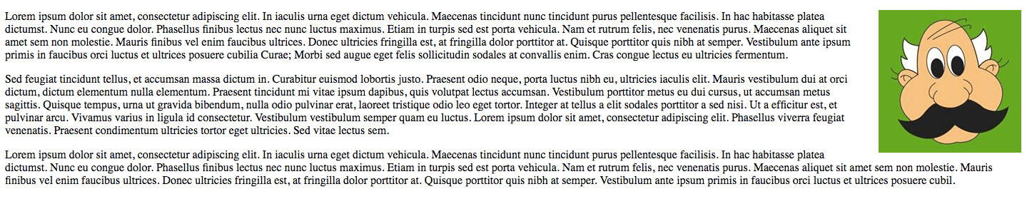
Right align
Now use this HTML code to align the image to the right of the text:
<div><img src="myimage.jpg" width="100" alt="My Image" /></div>
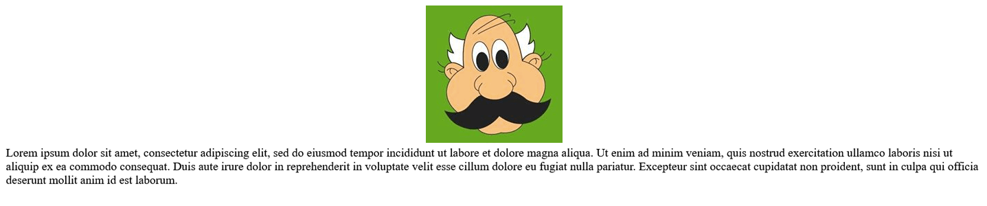
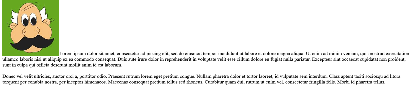
Center align
To embed the image within the text, use the following code:
<div><img src="myimage.jpg" width="100" alt="My Image" /></div>
This code will embed the image in the paragraphs, but it’s not a very clean layout.
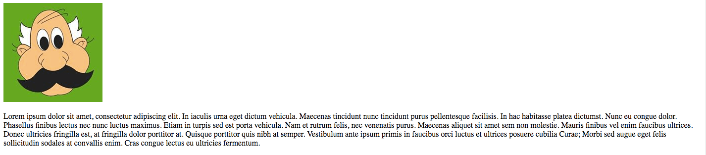
 Top and bottom align
Alongside left, right, and center alignment, you can use top and bottom alignment to define the arrangement of the text and image.
<img src="myimage.jpg" width="100" alt="My Image" />
With top alignment, notice how the Sed feugiat tincidunt tellus text aligns with the top right of the image.
<img src="myimage.jpg" width="100" alt="My Image"/>
With bottom alignment, the same text aligns to the bottom right of the image instead.
While HTML image alignment offers solutions for basic layouts, floating images with CSS code can offer more flexibility.
CSS floating images
Follow these steps to float images on your website to the right or left and use the “no float” or “clear” formatting.
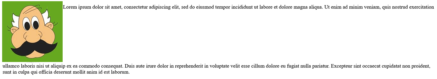
Floating images right with text wrapping
In this example, we include the image tag in our HTML file, but identify the image with an ID (“hp”).
<img src="hp.jpg" alt="" width="200" height="200" id="hp"/>
The formatting code is called from a separate CSS file, which includes the float:right rule, plus some additional spacing, courtesy of the margin rule.
#hp  {
float: right;
 margin: 0 0 0 15px;
}
As you can see, the resulting layout is neater, with text wrapping below the image.
Floating images left with text wrapping
With the image correctly tagged in the HTML file, you can simply edit the CSS rule to experiment with alternative layouts.
#hp  {
float: left;
 margin: 0 15px 0 0;
}
No float
Use the float:none rule to display the image in the text without any wrapping. You can retain the margin rule (if desired) for spacing.
#hp  {
float: none;
 margin: 0 15px 0 0;
}
Clearing floats
When floating images, it’s important that you use the clear rule correctly. Floated images (and other web elements) will overlap one another if you do not “clear” the float. Be sure to use the clear rule after each section in which an image is floating.
In this example, we have two sections (using div tags), one containing an image and the second containing an image, some text, and a red border. The first section is positioned using the float:left rule, and you can see that it overlaps the second section.
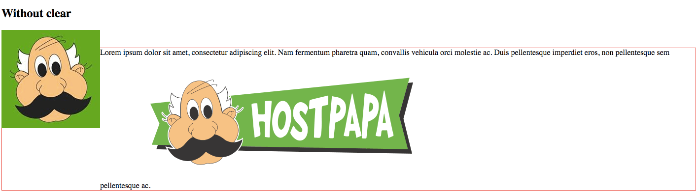
The overlap occurs because we have not used the clear rule. Apply the following CSS rule to the second div:
.div2 {
     border: 1px solid red;
     clear: both;
}
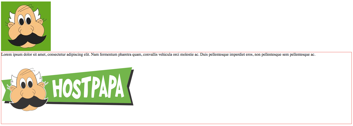
You can now see that the two sections are now no longer overlapping. The clear rule can be used with a number of values:
- none – allows floating elements on both sides.
- left – no floating elements allowed on the left side.
- right– no floating elements allowed on the right side.
- both – no floating elements allowed on either side.
- inherit – inherits the clear value of its parent.
Take some time to experiment with CSS rules like float and clear and you’ll soon master image alignment and advanced page layouts.
If you need help with your HostPapa account, please open a support ticket from your dashboard.
